Have you ever noticed how strongly we associate holidays with specific colors?
From Thanksgiving and Christmas to Easter and the Fourth of July, our celebrations are not complete without their signature color schemes. These established colors are reflected in holiday décor, invitations and even food. The same is certainly true for Valentine’s Day. Red – in every hue, tint, tone and shade – is synonymous with our expressions of love and admiration for others. Have you ever seen a blue Valentine?
Our preferences for specific colors and how the brain assigns meaning and emotions to these colors are rooted in psychology. The psychology of color has been studied extensively and can be traced back to ancient times. While there are variations depending on age, gender and culture, humans consistently associate certain feelings and emotions with specific colors. For example, green is largely perceived as a soothing “natural” color that has a calming effect. It’s, therefore, no mistake that the waiting area for an actor before a performance is referred to as the “green room,” often decorated in soft green hues and tones that create a relaxing environment.
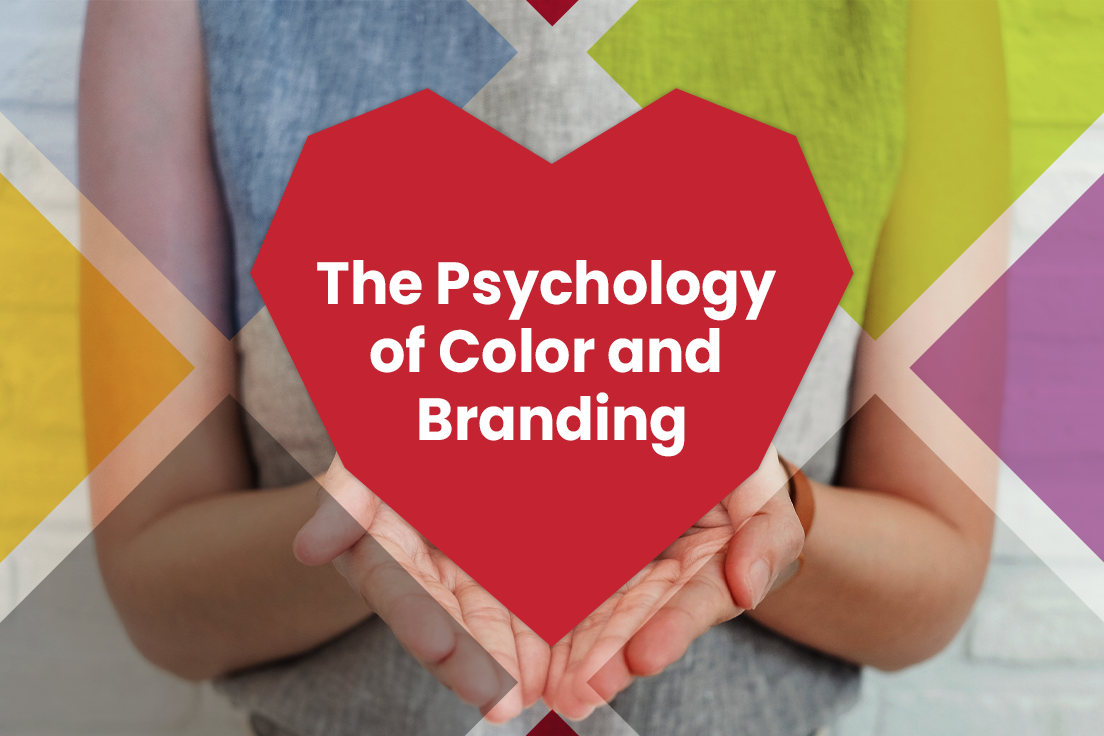
Marketers know that choosing the correct colors for brand logos, packaging and even products themselves play a direct role in consumer perception – and sales. Red is traditionally associated with passion, excitement and attraction. While using red obviously makes sense from a Valentine’s Day perspective, it also explains why this color is used heavily in B2B and B2C branding. I challenge you to think of a fast-food chain that doesn’t include red in its logo mark! Though there are a few, the overwhelming majority feature red. In fact, Delia Associates and many of our B2B clients also use red as part of their visual identity.
Color in branding is also a critical design choice due to consumer loyalty. Once a strong logo mark is established and embraced, it can be challenging to alter that logo or its featured colors. When The Gap drastically changed its iconic logo in 2010, online consumer outcry led them to ditch their rebrand effort and default back to the familiar logo within a week! When done correctly, rebranding – whether in design, color or both – can increase existing sales and reach new markets. But it must be done carefully and thoughtfully, always keeping customer loyalty and preferences in mind. Our recent logo redesign for our client, Fimbel strengthened the brand’s visual and graphic style, while further emphasizing its signature color: red.
With its beautiful red palette, Valentine’s Day is one “brand” that seems to have gotten it right the first time, with no redesign or rebranding needed anytime soon.
Happy Valentine’s Day from Delia Associates!
Ed
Is it time for a rebrand? Give us a call and we’ll be happy to help you make the right choices for your brand – and your customers.